


Client: Car-Freshner (maker of Little Trees)
Material: 2014 Perk Catalog
This 8.5”x11” eight-page catalog consists of product pack shots as well as images of products in use. I shot custom photography to supplement images supplied by the client. A 3x3 grid is used on the back cover as a solution to uniquely display a variety of product-in-use images.


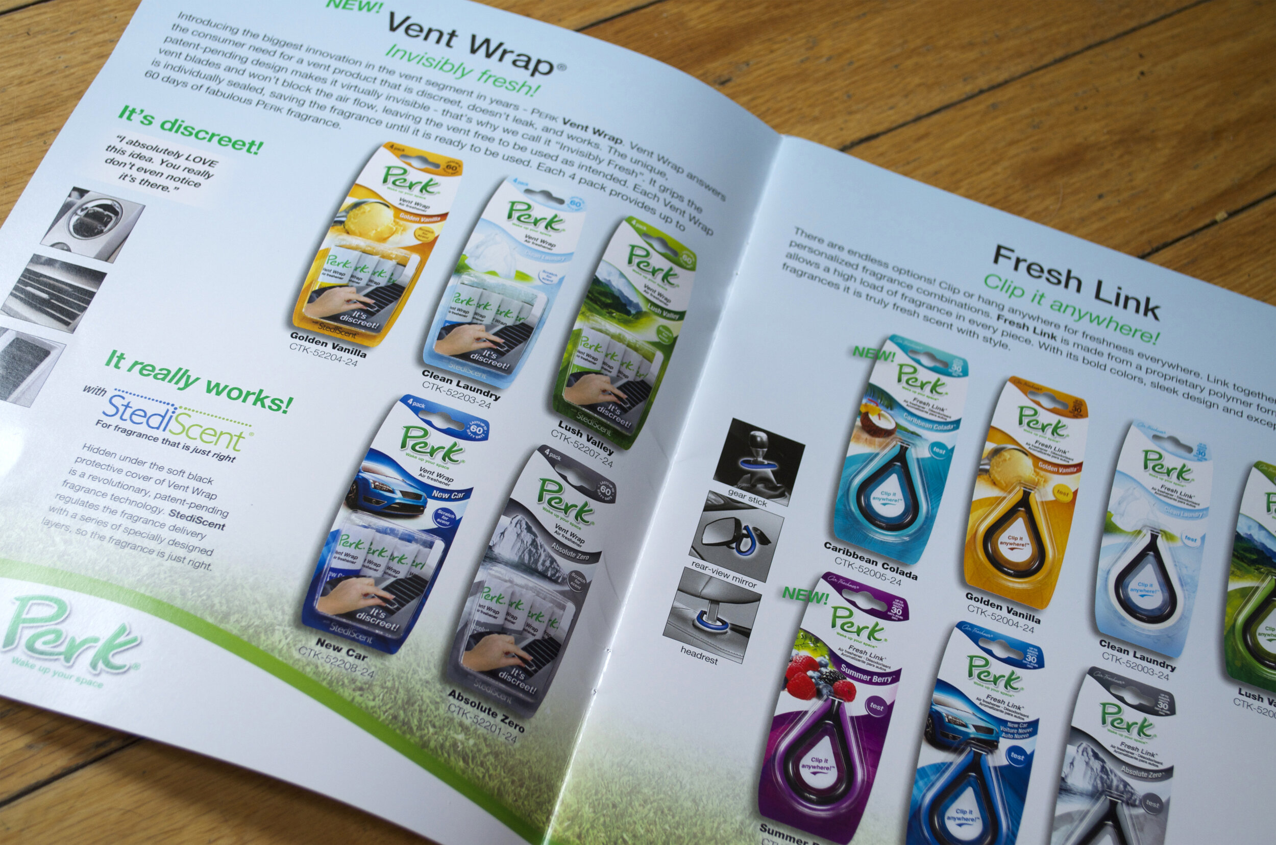
Client: Car-Freshner (maker of Little Trees)
Material: 2015 Perk Catalog
Like the 2014 Perk Catalog, custom photography was taken to supplement the client’s collection of product imagery. Car-Freshner was so pleased with the grid used on the back cover of the 2014 catalog, that they requested I carry the same layout to the 2015 catalog. Perk’s unique products are capable of being used in a variety of ways. The grid style allowed me to showcase this variety.
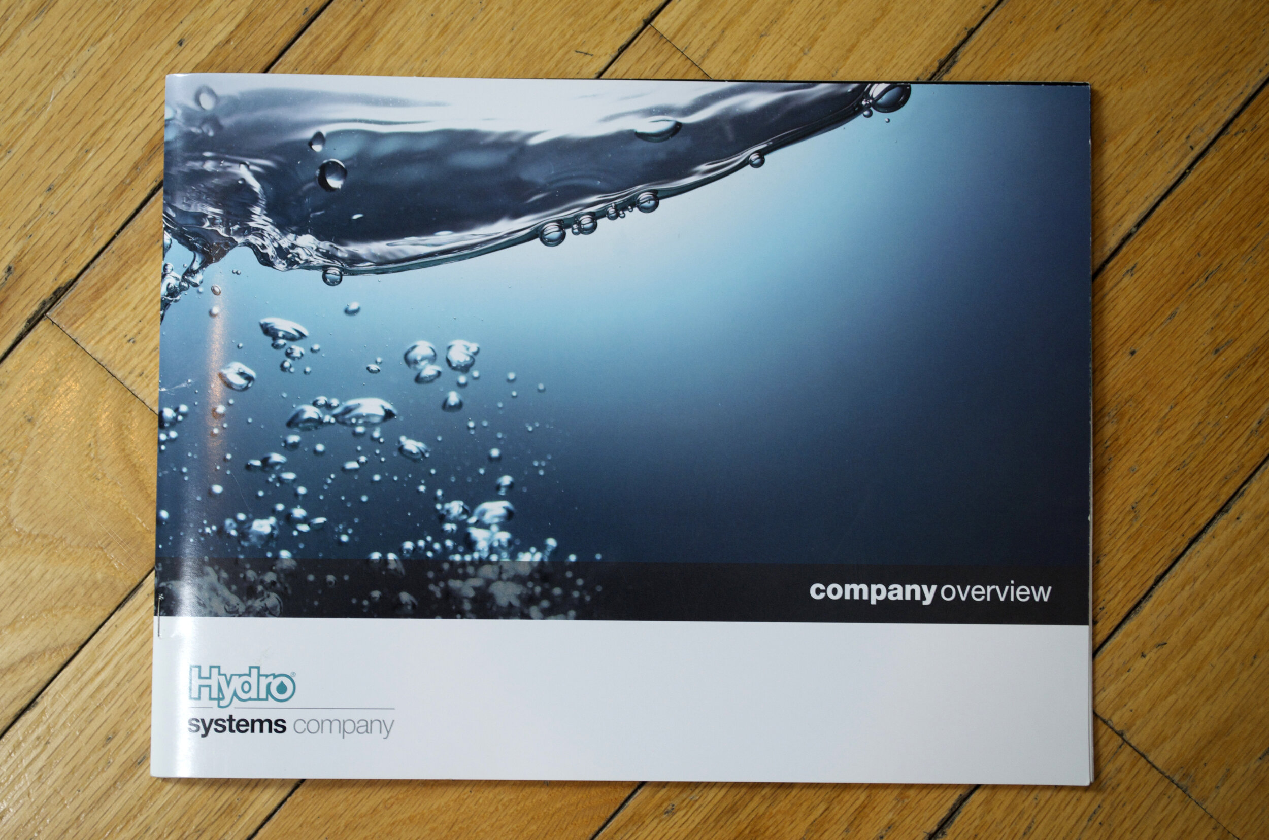


Client: Hydro Systems
Material: Corporate Catalog
Hydro Systems’ company overview is a marketing tool used by Hydro’s sales staff to introduce Hydro’s products and services to potential new customers. The unique size and format of this catalog allows for customization. The back cover not only provides a spot for the sales staff’s business card, but also contains a flap that is folded into a die cut. Once the flap is opened, individual product data sheets, catered to the customer, can be enclosed. The Hydro “drop” icon is applied in a full varnish in a couple locations throughout the catalog.


Client: Pole/Zero
Material: 2016 Product Catalog
I collaborated with two different groups within Pole/Zero to create one cohesive product catalog. This 100-page product catalog contains technical data that had to remain consistent throughout. The cover image echoes the spherical graphic found in the newly revised Pole/Zero logo.


Client: Clermont Catholic Communities
Material: Weekly Bulletins
The Clermont Catholic Communities’ weekly bulletin is a six-page, full-color publication I designed for six years. The current format consists of calendar events and current affairs within the community. I provided a majority of the photography as well as copyedited content the content. I collaborated with seven staff members in four parishes to produce this weekly publication.
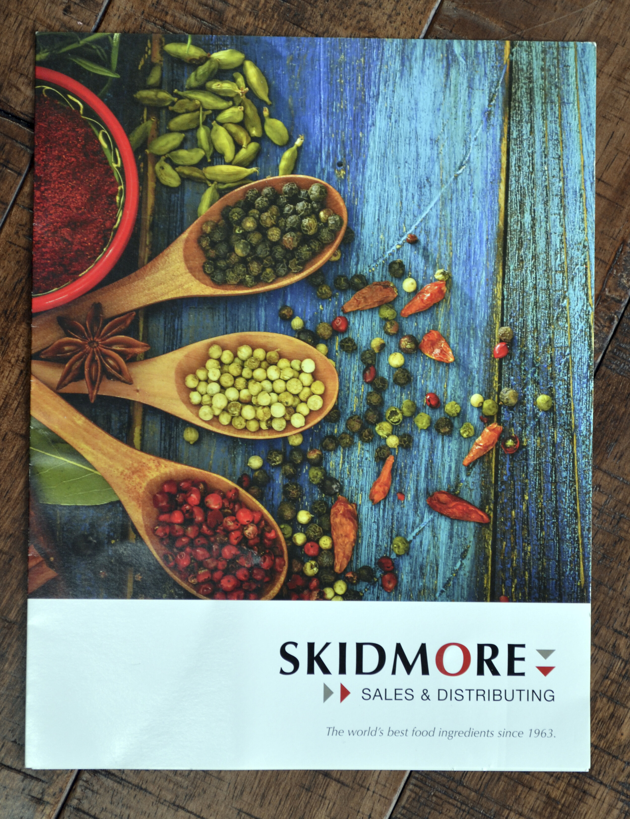


Client: Skidmore Sales & Distributing
Material: Product Brochure
This 8.5”x11” trifold product brochure details services and ingredients provided by Skidmore Sales & Distributing. Colorful food imagery coupled with product and service offerings speaks to Skidmore’s integrity.


Client: Essex Food Ingredients (a Skidmore Sales & Distributing Company)
Material: Product Brochure
This 8.5”x11” trifold product brochure follows the same format of the Skidmore Sales & Distributing brochure.


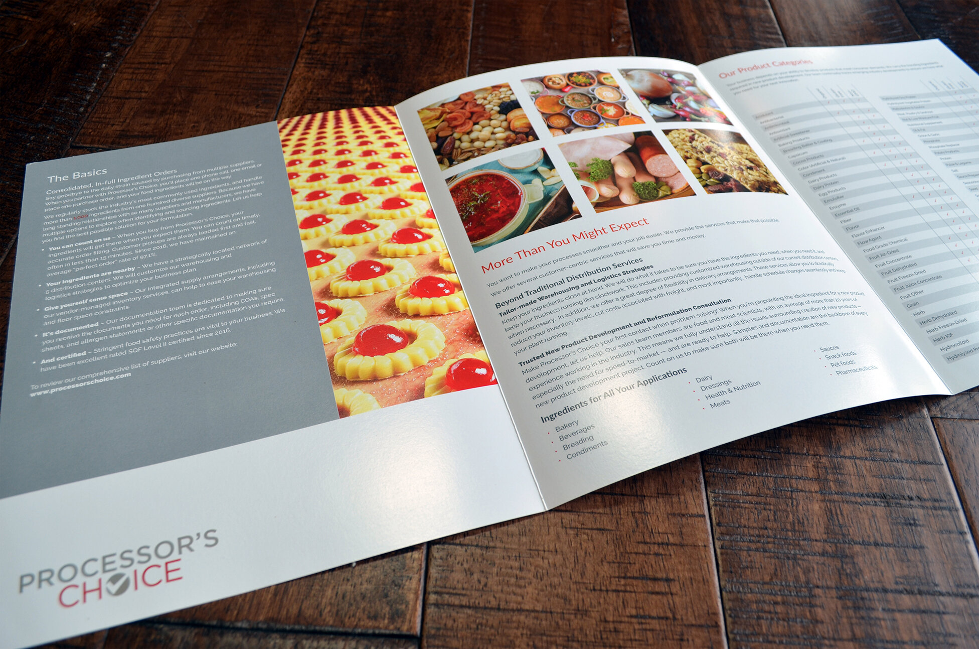
Client: Processor’s Choice (a Skidmore Sales & Distributing Company)
Material: Product Brochure
This 8.5”x11” trifold product brochure follows the same format of the Skidmore Sales & Distributing brochure.

Client: St. Louis School Parent’s Club
Material: Casino Royale Invitation & RSVP for fundraising “Grand Event”
I used retro graphics to create a classy, sophisticated brand to heighten this yearly occasion to a higher fund-raising level.
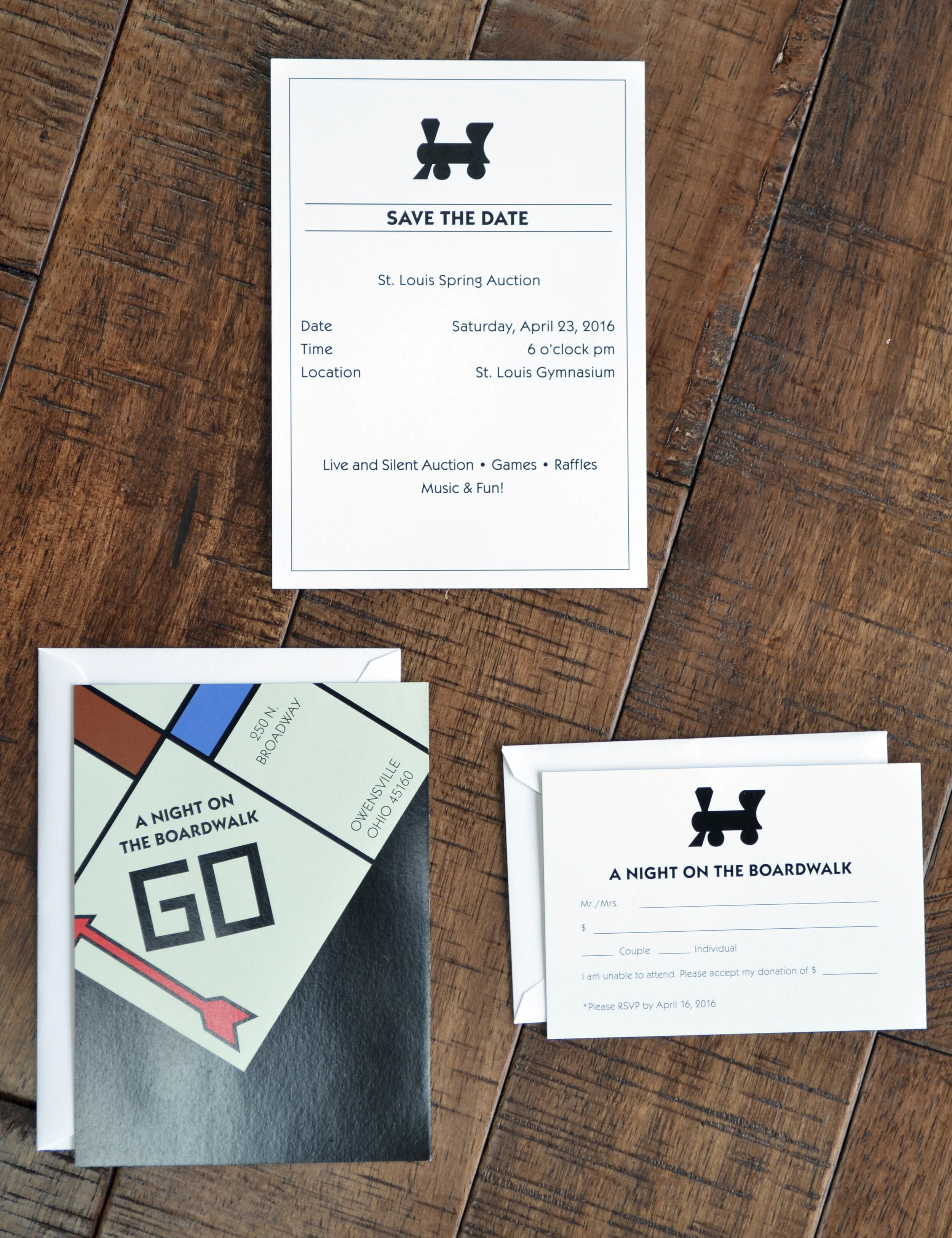
Client: St. Louis School Parent’s Club
Material: A Night on the Boardwalk save the date, invitation, & RSVP for fundraising “Grand" Event”
A Night on the Boardwalk materials use a Monopoly theme. The front of the invitation shows a corner of a Monopoly board, where the back side of the invitation is a square on the game board. I took a simpler, black and white approach to the save the date and the RSVP. The save the date was a teaser before the more colorful invitation was mailed.