ENVIRONMENTAL
Client: St. Louis Parish
Material: 2015 Homecoming Festival Poster
This full-color poster was printed 16”x22” and 25”x37”. It was used in the community to advertise St. Louis’ Homecoming festival. I created the St. Louis Church illustration in Illustrator as well as the poster. I was inspired by retro concert posters from the 60’s and 70’s.
Booth Display | 19’x8’
Banners | 8.5’x7’
Client: Hydro Systems
Material: Dairy Booth & Banners
The booth display and banners use elements from Hydro Systems’ brand. Designated division colors were used as well as the signature block grid. Photography representing Hydro’s client’s atmosphere was carefully scrutinized to ensure that the message resonated with their clients. The ornate “wings” in the exhibit mimic the curves used in the banners. In addition to the curves, design elements such as color, type, and spacing are similar as well.
Client: Hydro Systems
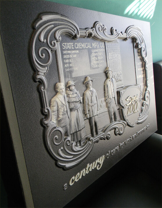
Material: 3D Sign Gifted to State Chemical
Hydro Systems commissioned me to create a 3D sign commemorating the 100th anniversary milestone for one of their leading clients, State Chemical. This was a unique situation where the client requested a specific medium for a project. I researched State Chemical’s history and found historical photos from the day the original store was opened. Its founding members are pictured in this image. I simply added a frame and emblem that embodied that time period and added their tagline at the bottom. I worked closely with the printer to ensure that the depth of the relief image was correct.
Client: Clermont Catholic Communities
Material: Clermont Catholic for Life Banner
This 8.5”x11” eight-page catalog consists of product pack shots as well as images of products in use. I shot custom photography to supplement images supplied by the client. A 3x3 grid is used on the back cover as a solution to uniquely display a variety of product-in-use images.


